
Grand One 2026
Paras digitaalinen ulkomainos
Loctite: Broken Words
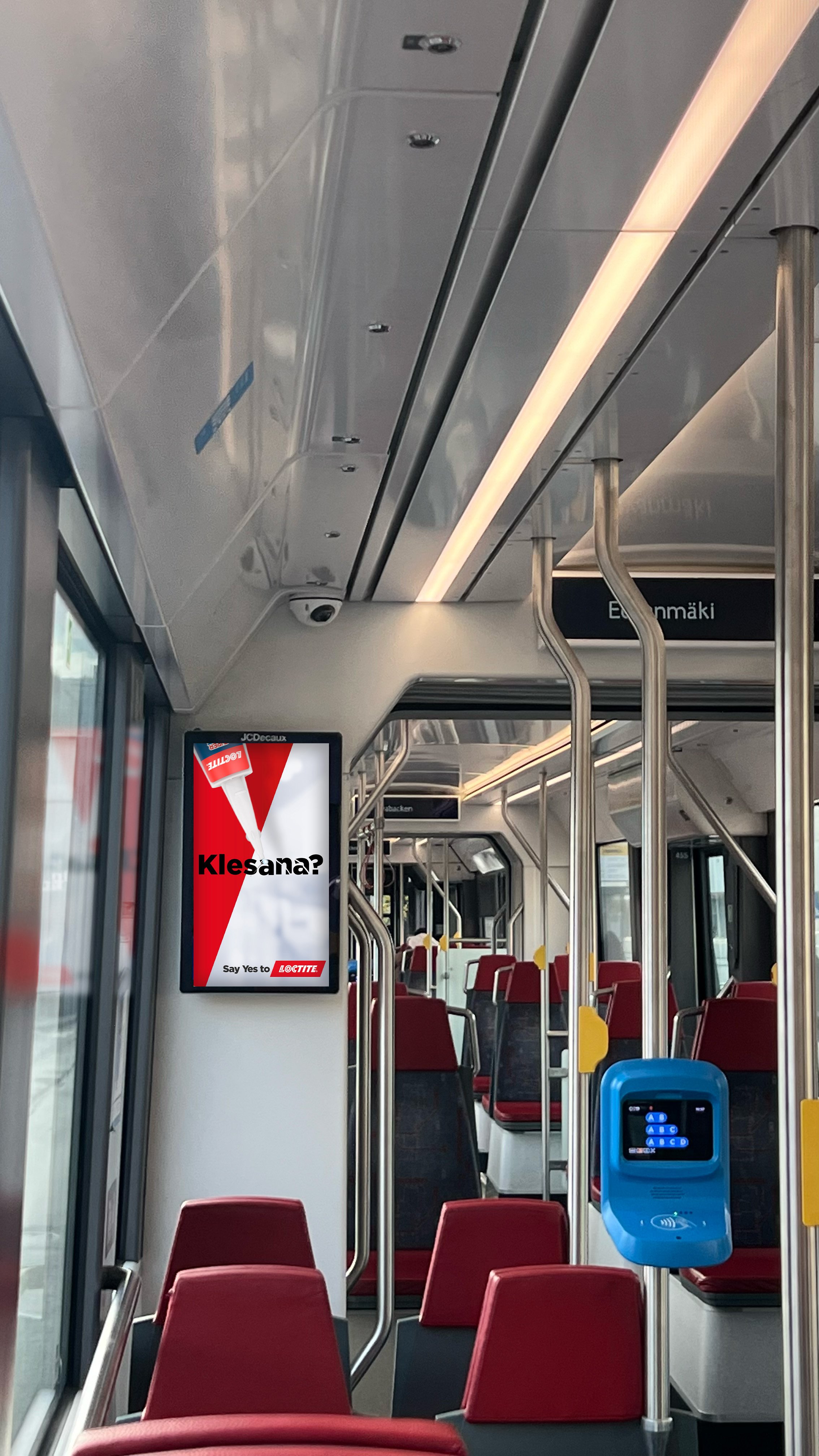
In a hectic city environment or a crowded metro station, an ad has about one second to grab someone’s attention.
Our goal was to remind everyone of Loctite’s superior fixing power with a visual payoff so satisfying that even the busiest commuter would want to see how it ends.
Feeling broken?
You are not alone.
Our primary goal was to boost Loctite’s brand awareness by leaning into a strategy built on words that hit home.
In the morning rush, people aren’t just commuting; they are often feeling a bit 'broken' themselves: tired, stressed, and stretched thin. Our insight was to use this shared emotional state to our advantage. And since Loctite is designed to fix what’s broken, it was a perfect match.
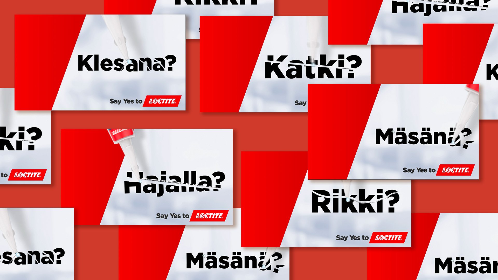
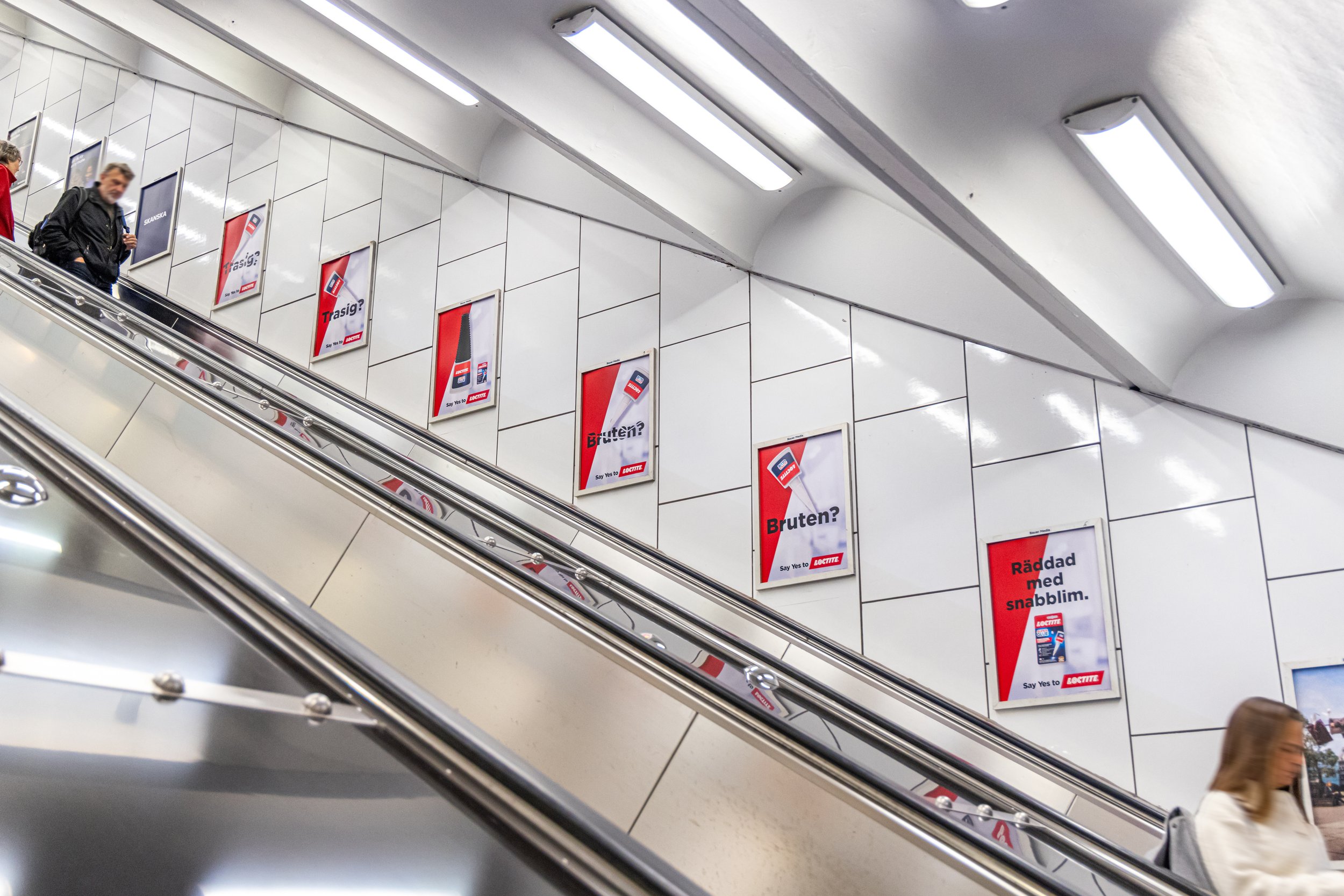
We ditched traditional, text-heavy advertising for bold, shattered typography that acted as a double metaphor for both broken objects and the fractured feeling of a hectic commute.
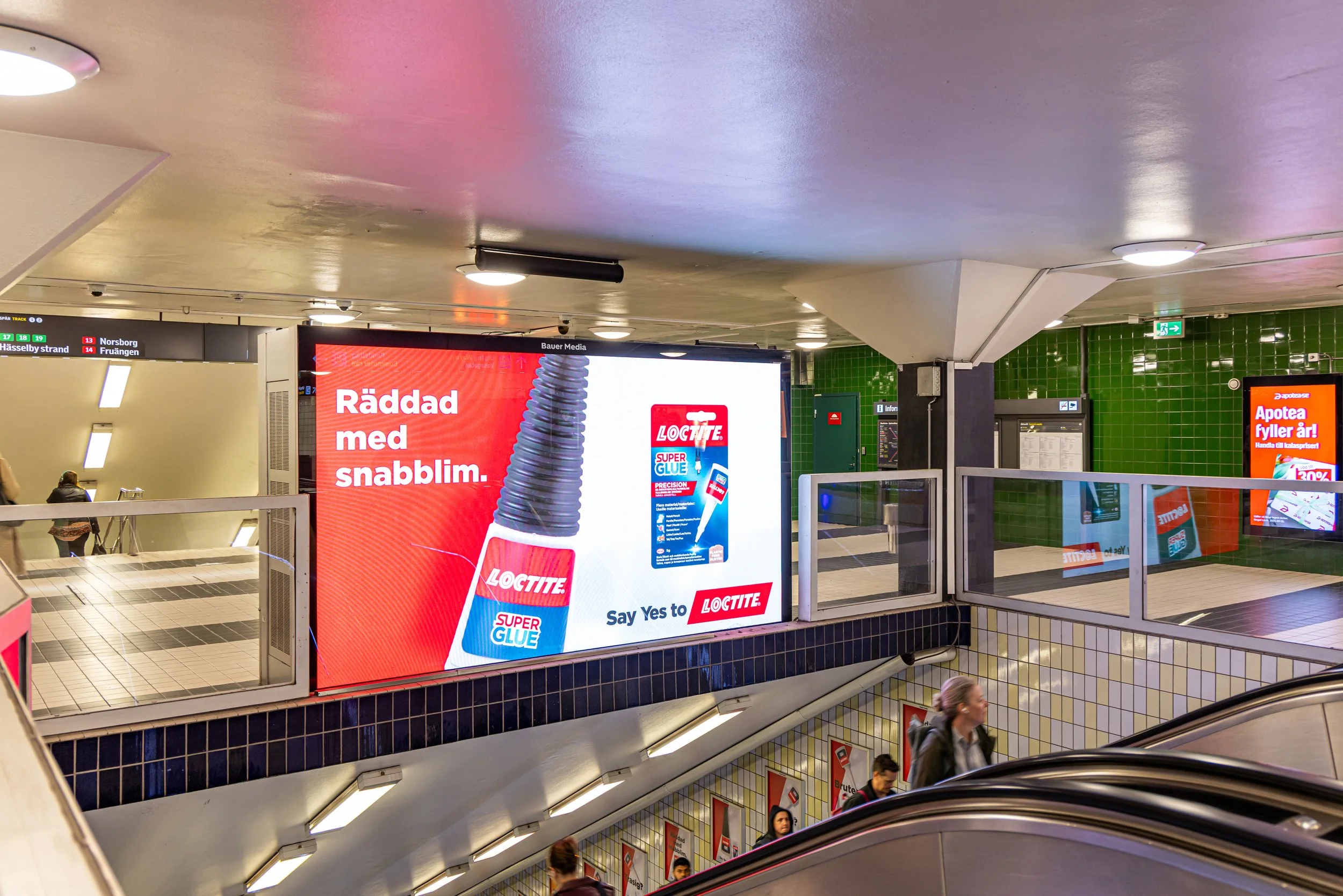
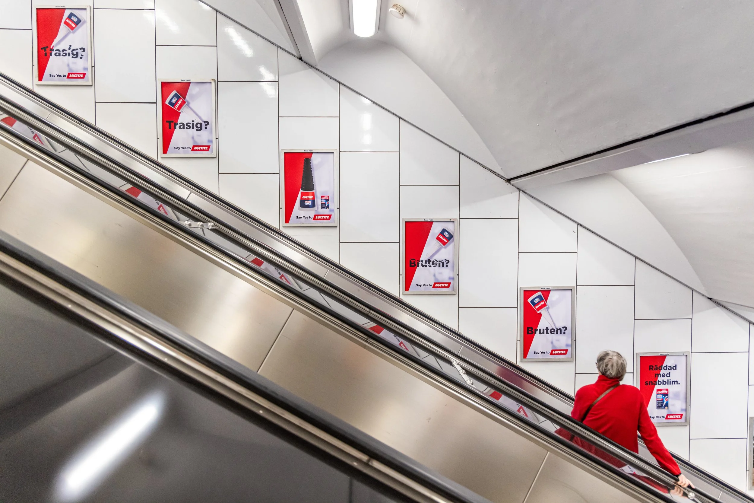
And of course, each story ended with a tube of Loctite to fix it all.
The campaign was rolled out across major DOOH hubs, including the Helsinki Metro and trams - both on platforms and inside the trains - as well as Stockholm’s Tunnelbana, strategically placing the ads in environments with long dwell times but fragmented attention.
The idea translated effortlessly across languages and markets. While the words changed between Finnish and Swedish, the insight remained universal: a broken message is instantly recognisable. And so is the satisfaction of seeing it restored.
Results
Finland
The campaign truly cut through the noise in Helsinki, delivering 5.8 million impressions and surpassing our original plan by 31.7%.
With 313,440 playouts (exceeding the planned amount by 32.7%), our concise visual message hit the mark and successfully boosted brand awareness.
Sweden
In Sweden, we scaled the approach across Stockholm’s Tunnelbana with 300 escalator placements in the city’s busiest hubs. The campaign generated 14 million impressions by sticking to a simple truth: people in escalators are bored and looking for something to read.
By placing our shattered typography right in their line of sight, we made sure they couldn't miss our message while they had nothing else to do.
Across both markets
Across both markets, the campaign proved that a great idea doesn’t need to be complicated to work. By combining repetition and scale with the right message and environments, we achieved our goal of boosting Loctite’s brand awareness.